Monday, August 30, 2010

NEVER ENOUGH by Anna Dello Russo


                            VOGUE Japan October 2010 by Anna Dello Russo


Never Enough!   


Fashion Story with Alessandra Ambrosio by Anna Dello Russo
Source: VOGUE Japan
 Photo: Giampaolo Sugra


 "When I was a child I dreamed of staying in a fabulous fashion store after it closed and playing all night long with the clothes, shoes and jewellry. Now my dream will come true ..." 

Anna Dello Russo

Source: Lane Crawford meets Anna Dello Russo, August 16th, 2010


          Enjoy!    AJ

Sunday, August 29, 2010

Rest In Peace

Corrine Day
Fashion photographer and iconic image maker
1965 - August 28, 2010


Freja by Corrine Day, Second Nature, Vogue UK November 2006

Image Credits: scans by tFS member truebluejen, corrineday.co.uk

Friday, August 27, 2010

Two for One

Two stories, two similar surface appeals, two different reactions....

Starting with the good. Vogue Paris + Mikael Jansson + old French horror story set in the Louvre = me taken totally by surprise
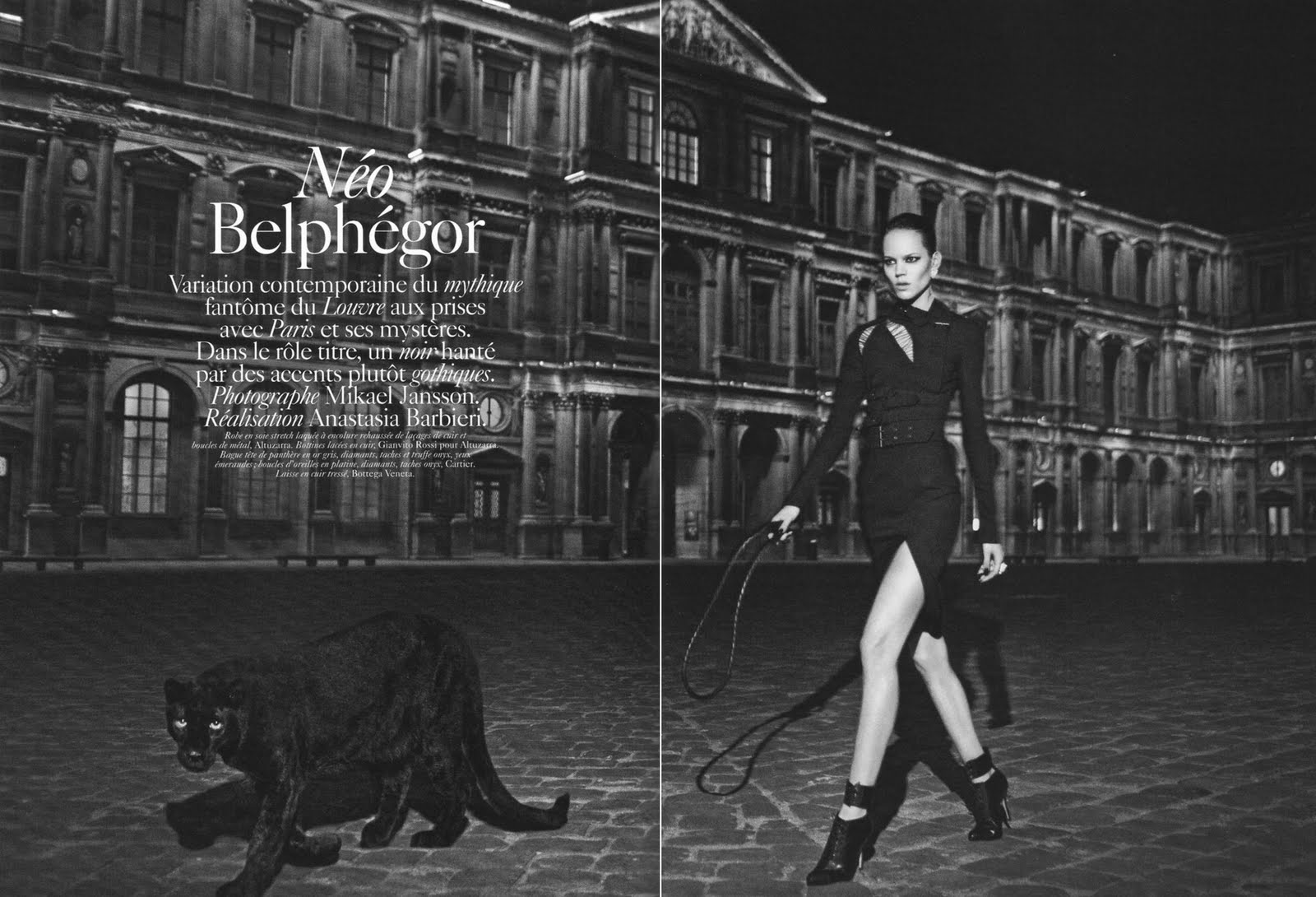
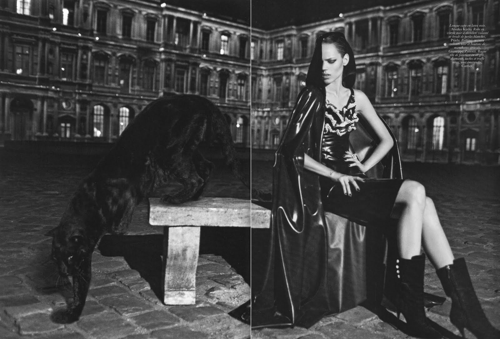
Neo Belphegor
Vogue Paris September 2010
Ph: Mikael Jansson
Styling: Anastasia Barbieri


Have to admit I wasn't too excited about this editorial when I first saw the preview snaps, but after seeing these images I've completely changed my mind. The patina of these shots are manipulated in just the right way that they add to the overall chill of the story. The dark aura and elements enhance the myth of the story and the feeling of dread you get from the potential threats lurking in the shadows. Freja is sinister, the panther is eerie, and if you look at the images in just the right way under just the right light, you'll get slight shivers up your spine.


Even though I'm already tired of the new model stereotype of Freja as the tough, dark, mysterious, cool girl (although I suppose it's better than being solely the androgynous girl), it plays well in this particular editorial. Freja makes for a great villain, and she's emoting well, especially in the shot where she's sitting down. Yes, the dangerous but glamorous femme fatale role is a bit trite, but when it's done well I don't mind seeing it again.


It's Freja's third time working with Jansson, but we have yet to see color work from the two of them. Luckily Freja has a face with angles and planes perfectly capable of expressing wide range and depth without the aid of the color spectrum. Just take a look at the history of their work together and you'll see (Pop Magazine part 1 and 2, Interview Magazine). So maybe all the b&w is deliberate...like a careful case study over time. I absolutely can't wait to see this in print, because 99.99% of the time editorials look better when they're in print and in your hands instead of on your computer screen.

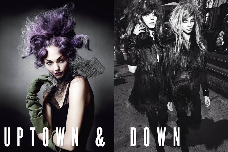
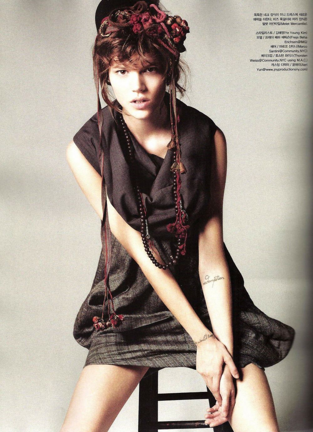
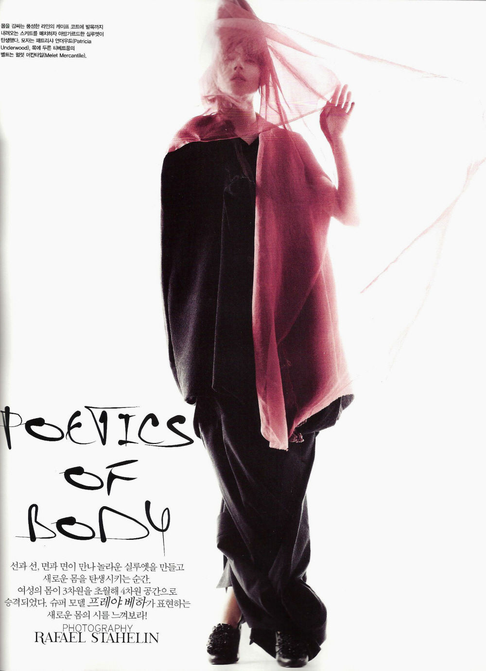
Now another b&w editorial, but with a less positive outcome in my mind.
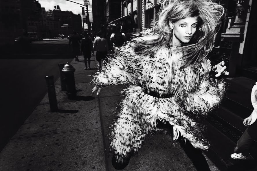
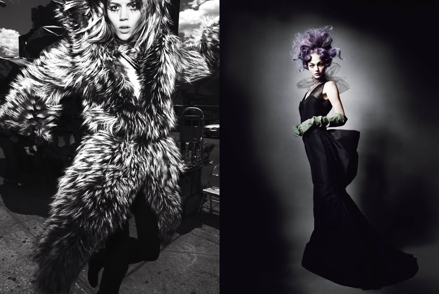
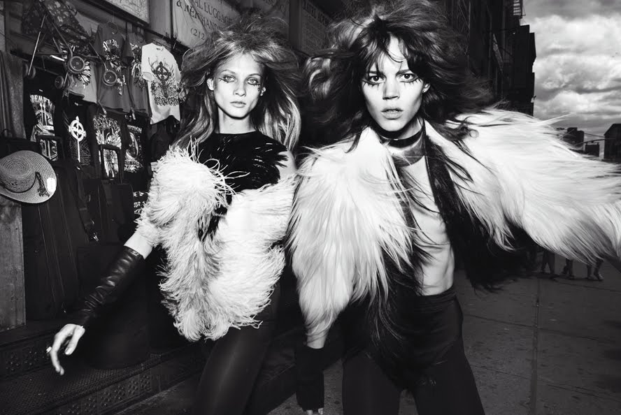
Uptown and Downtown
V Magazine #67 September 2010
Ph: Mario Testino
Styling: Sarajane Hoare
Other Models: Anna Selezneva, Carmen Kass, Sasha Pivovarova


Too bad Freja's first collaboration with Testino since early 2007 had to be this unremarkable story. Not a fan of the deer in headlights look, messy hair, and fur and feathers galore. I much prefer Sasha and Carmen's "uptown" shots, where the studio setting (although usually boring) provides a good contrast to the clothes, hair and makeup. Freja and Anna's "downtown" shots are too busy for me. Too much to look at, too much of it being pushed in my face, too much to distract me. What's the point? What's the purpose? What's the message? Why does Freja look so confused? How many licks does it take to get to the center of a Tootsie Pop? The world may never know....


Freja, I love you and your work, I really do. But I have to wonder....does modeling treat you badly? Are you unhappy with your job? Because why the hell can't we see you smiling and in something happy? If I only had your recent editorials to look at, I'd think the world was approaching its end or something. I know it's not your fault. You're doing the best with what you're given in the parameters you're allowed to work within. But I hope people give you chances to expand beyond and move away from this, just like they finally gave you chances to move away from all the androgyny. Until then, I'll just be happy that you're getting work with a wide range of photographers and people, but too bad you don't look more happy about it. :)

Image Credits: Scans via tFS member Carla-A, vmagazine.com

Thursday, August 26, 2010

FUR SAUVAGE by Roberto Cavalli


ANDREA JANKE presents FUR SAUVAGE 
                                              by Roberto Cavalli

"Forty years of Roberto Cavalli - it scarcely seems credible. How many in the enormous audience for his Fall presentation were even born when he first set needle to appliqué to denim in his little shop in Saint-Tropez?  ... it's hard not to come over all Renaissance-like with Cavalli, because his appreciation of the artisanship of his native Florence has always been greatest asset. In this collection, his use of brocade, dévoré, studded leather, and embroidered broadtail all felt like vintage flourishes out of time. Even his signature brash animal prints were blurred and faded, as if time had its way with them. It was romantic in its own decadent way. The impression was compounded by a backdrop that impressively evoked a crumbling palazzo. Still, there was promosing modernity in the way Cavalli composed outfits from light, multilayered pieces.


In his show notes, the designer claimed he'd always created dresses for the most beautiful women and "for men who need the beauty of women to complete themselves."(Roberto Cavalli)


Roberto Cavalli
http://www.robertocavalli.com

Source: Style.com; Editorial by Tim Blanks
Photo: Marcio Madeira/Don Ashby/Olvier Claisse, FirstView

Wednesday, August 25, 2010

Poetics of Body

Not quite sure what to say about this. I actually haven't had much to say about a lot of things recently, which is pretty strange for me and this blog because I do love a good rambling. Readers who've been with me for a while can attest to that. Anyway, I guess I should first let the work speak for itself. As for what it says, that's open for interpretation.

Poetics of Body
Vogue Korea September 2010
Ph: Rafael Stahelin
Styling: Ye Young Kim


I do have to say one thing. With the title "Poetics of Body" you'd think they would put more effort into making Freja look poetical or lyrical instead of making her look like she was attacked by piles of black clothing. But maybe that's an issue of language, translation and semantics. Either way, I really would have liked to have seen more elegance and subtlety. Don't drum up my expectations with words, only to counter them with your images. I can't say I'm a big fan of this. It's not her best work, but it's not her worst work either. To my mind, it's really just....work.


Now that people have finally moved away from pigeonholing her with the androgyny shtick, we've seemed to move into a newly dominant "too cool for school" characterization that also does no justice to Freja's full capabilities and talents as a model. But c'est la vie in the modeling world. Part of being successful is occupying a role and niche in the market. You do your character and you do it well. But to a fan like me, this gets old pretty quickly. Seeing the same thing over and over again doesn't inspire me. It doesn't enrage me. It just makes me feel apathy, which is a far more dangerous thing to feel when it comes to your favorite model. I mean, I can't be the only one dying to see Freja in full haute couture acting super delicate and feminine in a field of daisies, right? Or am I? Maybe I am.....

As with most things in life, we go through stages of ups and down, likes and dislikes. Regardless of what you might think of me since I do run this blog dedicated to her, I don't always like everything that Freja does and I don't worship the ground she walks on. I write about her because I find her and her work interesting and intellectually intriguing; although I will admit that her second "career rejuvenation" has made those things seem less so to me. How ironic that the more work I have to look at, the less I find myself inspired to say something about it. A lot of the intrigue and mystery that I was so drawn to two years ago when I started this blog is being eaten up and replaced by her ubiquity and extreme success. I'm happy for her of course (!!) but it's a bittersweet feeling that I'm not quite sure how to express without alienating some of you, so sorry about that.

I guess I'm going through one of those dips instead of hitting one of those high crests. Saw previews of both the upcoming Vogue Paris and V Magazine edits and I'm not too impressed with either. But maybe HQ images will change that. So until then, I would love to hear your thoughts on the matter. Maybe some other long term fans who feel differently? Or the same? Is it inevitable to fall into some sort of apathy after literally years of following someone's work? Hopefully the SS11 shows around the corner are just the thing to get me excited again.

Image Credits: cheny1117 @ sfileydy.com

Monday, August 23, 2010

Julien Fournié - The New Generation of the Parisien Haute Couture


ANDREA JANKE lovin Julien Fournié Haute Couture Fall 2010

the new generation of the Paris Haute Couture. A fabulous collection including sophisticated fur details like mink and fox-intarsias. 


"Inspired by martyrdrom, Julien Fournié elicited beauty from darkness and sadness usually associated with the suffering of death on account of adherence to a cause, especially to one's religious faith.

Using blood red crystals on embroideries and handpainted inked shadows to represent the scene of the slaughter, Julien Fournié did not include any references to religion but blended street culture with the use of big zippers strategically placed as perpendicular or diagonal slashes. 

Whether by choice or by accident, Julien Fournié has become a harbinger of the new generation of designers in the Paris haute couture scene who emerged post the Great Recession." (Source: Fashionwindows.net)


"Un nouveau défilé parisien en quasi plein air, Julien Fournié a pris ses quartiers á la Cité de la Mode et du Design, pour présenter á la lumiére du jour et en bord de Seine les premiéres pieces Haute Couture de sa marque éponyme. Une collection sous le signe de la vulnérabilité, toute en transparence, délicatesse et sur fond d'opera."  (Source: Puretrend.com; Editorial by Mélody Kandyoli)


Julien Fournié Haute Couture FW 2010/11