We all have our traditions. Usually around this time of year most Americans are fresh off a weekend of grilling out and watching fireworks in celebration of the July 4th holiday. Freja, on the other hand, always seems to find herself jetting from Denmark to Paris around this time of year; going from crowded, dirty concert tents to immaculate, luxurious runways.
The Roskilde music festival is arguably one of the biggest draws on the European festival circuit. Freja was there last year decked out in some Alexander Wang, and seemingly not one to break with tradition (or give up on her love of music), she was there again this year also decked out in Alexander Wang.
Coincidentally, I happen to own the same green A Wang vest and let me tell you, it's amazing. (I swear I bought it before I knew Freja had it! Contrary to what you may think, I'm not that type of fan.) As soon as I saw the look on Iselin during the SS10 show, I just knew I had to have it. The best thing about it is the long, draping back made of black nylon. The panel wafts up in the air as you walk, kind of like a cape. So just picture Freja walking around, made even more imposing by a black cape trailing behind her. Pretty cool.
Anyway, judging from the blog post of the person who saw her at Roskilde, she was there on Friday, July 2nd. But yesterday, July 6th, saw her in Paris walking the Chanel Haute Couture F/W 2010 show just like last year.
No surprises here. You can always count on Karl and Freja. They're like Archie and Jughead, Sonny and Cher, Turner and Hooch, Inez and Vinoodh. ;) I may have ragged on some of their past collaborations, but I am truly grateful for their relationship. It's reliable and comfortable; a rarity in the fashion world where seasonal change triumphs.
Freja didn't open or close, but she had one of the last showstopping looks. From an Alexander Wang green military style vest to Chanel sequins and beading, Freja effortlessly moves from one look to the other. I never find myself surprised at the way she looks. No matter the setting, no matter the context, no matter her surroundings, Freja always looks like she inherently belongs. She never looks like she's out of her element; but rather, she always looks to me as if she's completely in it. And that's the mark of a true model.
So where next? From Denmark to Paris to the next job, wherever it may be. Here's hoping it's a good one!
Image Credits: fromthedeskofphyllis.blogspot.com, boohyouwhore.com, style.it
Wednesday, July 7, 2010
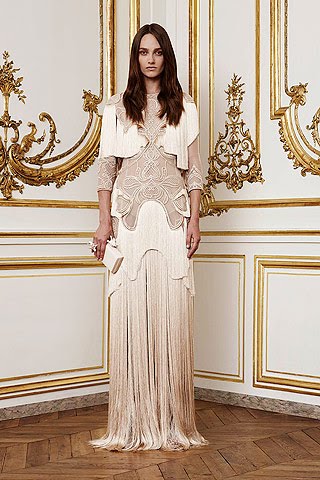
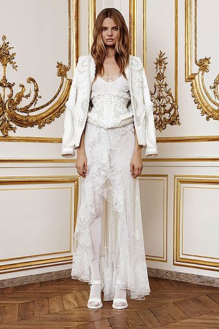
GIVENCHY - 'The Bone Collection' by Riccardo Tisci
Andrea Janke featuring 'the bone collection' by GIVENCHY
"The history of haute couture is studded with magnificent obsessives like Cristobal Balenciaga and Charles James. Even if Ricardo Tisci's name never makes it onto that list, his latest Couture collection for Givenchy proved that he shares the grandmaster's fanatical devotion to realizing an intensely personal vision through cut, cloth, and, in Tisci's case, extraordinarily elaborate ornamentation..."
"the bone collector
"... The darkest colour in the collection was the chocolate brown on those feathers. Otherwise, everything was white, flesh-colored, or gold, with a salor dedicated to each shade. Even the baboon fur what was attached to the swallowtailed knit jacket was spookly bleached. ... He (Tisci) claimed his inspiration was Frida Kahlo and her three obsessions: religion, sensuality, and, given the painter's lifelong battle with spinal pain, the human anatomy. The dominant motif of the collection was the skeleton, laid out flat in the lace appliquéd on a long tull column, or rendered in three dimensions in obsessively dense clusters of cristals, pearls, and lace on the back of a jacket in double silk duchesse satin..."
"Tisci showcased lace catsuits, one decorated with a Swarovski crystal skeleton that took 1,600 hours to create. In the third, "gold" room was a lace dress that demanded six months of work. Dresses encrusted with gold paillettes, stones, and beads were almost to heavy to lift, despite being revealingly scissored away at the waist..." (Paris, July 6, 2010, by Tim Blanks for style.com)
GIVENCHY
Source: Style.com
Accessories: ANDREA JANKE
Artistic Director Website: Andrea Janke
Tuesday, July 6, 2010
The Valentino Woman
Who is the new Valentino woman? Take a look at the new ads and see if you can answer that question. I'm not sure that I can....yet.
Valentino F/W 10.11 Ad Campaign
Ph: David Sims
Other models (not pictured): Monika Jagaciak, Tati Cotliar
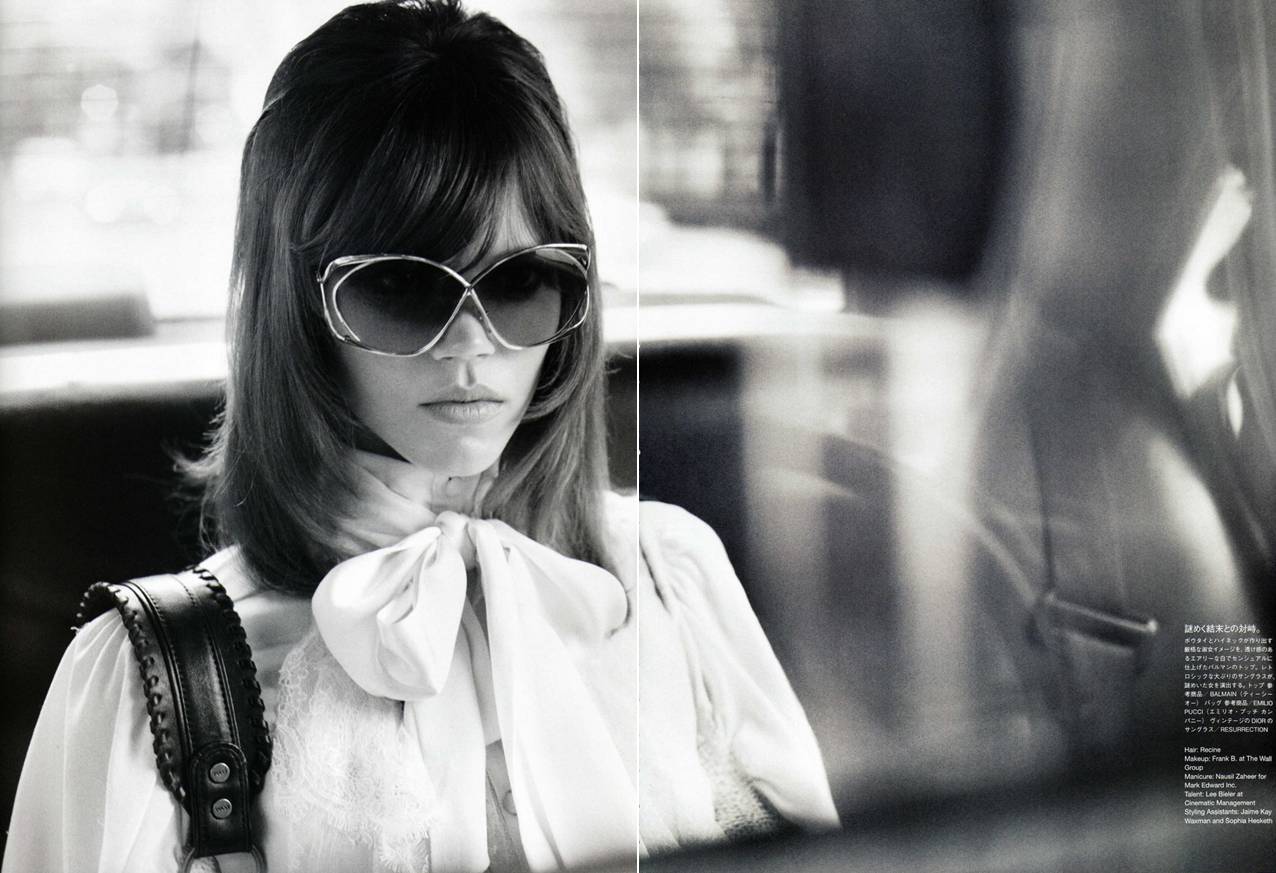
I know that Maria Grazia Chiuri and Pier Paolo Piccioli have taken the house in a decidedly more modern direction, but do these ads reflect that? They do when it comes to model choice, because never, ever would Freja have been a Valentino woman if Mr. Valentino was still in charge. But the choice of using black and white photography to convey this new modernity is a bit too antagonistic and old fashioned to me. Although, now that I think about it, perhaps this is the perfect way to express the conflict and uncertainty bound to rear up whenever a new generation takes over an established entity.
You'll always have those longing for the past, happy to live in their idealization of the glory days. Then you'll have those happy in the onslaught of technology and progress, thrilled to see the inevitable ebb and flow of change that the passage of time brings. The more I look at this campaign, the more I can see both sides of that coin there-within. A certain deference and allusion to the past with the photography and even the setting (gilded mirrors and crystal chandeliers of the actual historic Parisian headquarters of Valentino); yet at the same time, a nod to the present and the future with unconventional model choices who have their bodies on display in such a way only permissible by today's much more relaxed standards of propriety.
Do I like this? I'm not sure yet. Ask me again at the end of the season. Do I think this is interesting? Most definitely. Am I over analyzing as usual? Probably. But it's what I do best. I still don't know who the new Valentino woman is. I can't figure out who Maria and Pier are trying to target with these ads and who they're trying to get to buy their clothing. So instead I'll just sit back and enjoy the fact that Freja is a Valentino woman, tattoos and all.
Ten years ago it was so rare to see visible tattoos on the runway. Now Freja's are being displayed in nationwide ad campaigns. Amazing indeed, and yet another signifier for the changing times and generations. Her tattoos are now inseparable from her image as a model, as well as being inseparable from the surface of her skin. Kind of like her trademark, and in that respect I feel she's a larger model personality than most people give her credit for.
They say the era of the supermodel is over. But they say nothing about the era of the cult personality model. So we'll see who people will remember in 20 years time when they look back on this decade.
Image Credits: valentino.com via tFS member Carla-A
Valentino F/W 10.11 Ad Campaign
Ph: David Sims
Other models (not pictured): Monika Jagaciak, Tati Cotliar
I know that Maria Grazia Chiuri and Pier Paolo Piccioli have taken the house in a decidedly more modern direction, but do these ads reflect that? They do when it comes to model choice, because never, ever would Freja have been a Valentino woman if Mr. Valentino was still in charge. But the choice of using black and white photography to convey this new modernity is a bit too antagonistic and old fashioned to me. Although, now that I think about it, perhaps this is the perfect way to express the conflict and uncertainty bound to rear up whenever a new generation takes over an established entity.
You'll always have those longing for the past, happy to live in their idealization of the glory days. Then you'll have those happy in the onslaught of technology and progress, thrilled to see the inevitable ebb and flow of change that the passage of time brings. The more I look at this campaign, the more I can see both sides of that coin there-within. A certain deference and allusion to the past with the photography and even the setting (gilded mirrors and crystal chandeliers of the actual historic Parisian headquarters of Valentino); yet at the same time, a nod to the present and the future with unconventional model choices who have their bodies on display in such a way only permissible by today's much more relaxed standards of propriety.
Do I like this? I'm not sure yet. Ask me again at the end of the season. Do I think this is interesting? Most definitely. Am I over analyzing as usual? Probably. But it's what I do best. I still don't know who the new Valentino woman is. I can't figure out who Maria and Pier are trying to target with these ads and who they're trying to get to buy their clothing. So instead I'll just sit back and enjoy the fact that Freja is a Valentino woman, tattoos and all.
Ten years ago it was so rare to see visible tattoos on the runway. Now Freja's are being displayed in nationwide ad campaigns. Amazing indeed, and yet another signifier for the changing times and generations. Her tattoos are now inseparable from her image as a model, as well as being inseparable from the surface of her skin. Kind of like her trademark, and in that respect I feel she's a larger model personality than most people give her credit for.
They say the era of the supermodel is over. But they say nothing about the era of the cult personality model. So we'll see who people will remember in 20 years time when they look back on this decade.
Image Credits: valentino.com via tFS member Carla-A
Monday, July 5, 2010
Beliefs vs. Fashion
The Untold Crime
Vogue Nippon August 2010
Ph: Terry Richardson
Styling: George Cortina
It's taken me a long time to write about this editorial, mainly because I didn't know how to approach it. Sure the styling is great, Freja looks beautiful and overall the story is aesthetically pleasing, but it's shot by Terry Richardson. How can I reconcile my dislike for him with the fact that I'm essentially promoting his work every time I post it on this blog? And yet, I can't ignore his work with Freja because lately it's become a big part of her career (much to my dismay). Her last two editorials have been shot by Terry, and since she seems to be a new Vogue Paris "it" girl, you can bet that a lot more of her future work will be shot by Terry as well. As a blog that purports to be about Freja's work and her place within the industry, I can't ignore this aspect of it as much as I want to.
But hey, doesn't one of life's greatest lessons teach us that ignoring problems won't make them go away? So despite my extremely conflicted feelings I'm going to address this editorial and why I think it's existence is so problematic and so emblematic of the negative aspects of the fashion industry today. Now before you harp on me for being overly sensitive, prudish, extremist or whatever else you want to call me, you should know a few things about what I believe:
-The work that someone produces (no matter how good) should never be used to justify his harmful actions. I don't believe in compartmentalizing or creating a separation between the two because that can lead to a very slippery slope. Let me put it another way--would you excuse a priest who has sexually molested a boy just because of the work he does in his church? In this case would you ever create that separation? So even if I like how this editorial looks, I feel that to concede to it would essentially be to condone Terry.
-There is already an inherent power imbalance in the photographer/subject relationship made all the more worse by those who think they can sexually coerce others in the name of their "art." Our apologetic society, when faced with these issues of sexual impropriety, tends to blame the victims instead of force the perpetrators to take responsibility for their actions.
-Basic human rights and values should take precedence over all else, pretty editorials and fashion products included. Nothing can justify the degradation and exploitation of another human being. And as they say, a picture is worth a thousand words, but it's not worth basic human dignity and decency.
-Just because something is commonly done among a group of people doesn't make it right. Nor does it give us the right to apathetically accept their actions as the status quo. If people throughout history had thrown up their hands in defeat whenever they were faced with rampant injustice, the world would be a much different place. I've heard so many times that Terry isn't the only photographer with a questionable work approach. But you know what? He's the most obvious and prominent offender with plenty of accusations stacking up against him and a body of work that shows it. If nothing can be done about him then the fashion industry is facing bigger problems than declining sales figures and pinched bottom lines.
I'm well aware that I'm not in any position of authority here. I exist outside the fashion industry and this blog exists on the very periphery of the fashion landscape. Most of the time I feel very guilty and hypocritical for consuming as much fashion as I do. I don't even know how many people are actually going to read this whole post. Maybe a handful of you if I'm lucky? My attempts to keep this issue from disappearing seem futile, but I would feel even worse if I didn't even try to say something about how disappointed I am that Terry continues to work for high profile clients despite everything that has transpired. Way to go fashion! Way to have a backbone and stand up in solidarity with the women you profess to love and empower! Oh wait....
To top it all off, it seems like Terry has toned down his aesthetic in order to appease the situation. This editorial (and also the last one he shot for W magazine) is decidedly less provocative than the work he was doing prior to the accusations. Hmmmm....I do believe this is intentional. In the same vein of him taking down certain pictures from his blog immediately after the clamor over his scandal erupted, I can't help but think that Terry is toning down his work to placate naysayers. And sadly, it seems to be working. After all, his work is back in the pages of W Magazine after a long hiatus, and general consensus about this editorial seems to be positive. It's as if everyone has already forgotten that the scandal even happened.
Well I'm not ready to forgive and forget just because Terry took some good pictures. But it's so disheartening to realize that nothing will ever be done, and that he will continue on without suffering any consequences. Instead of facing the issue and taking action, the industry at large (minus bloggers) has ignored allegations against Terry. In fact, it feels like they've rewarded him in a way. His work is showing up again in a mainstream publication that he's been banned from for many years (Stefano Tonchi, if this is the direction you're going to take W magazine in, I wish you would have just stayed at T.) And his fashion friends have been doing damage control by coming out and making statements to the effect that he isn't a bad guy. Now people have stopped talking about the issue as well. If we aren't the ones to make a big deal out of this and if we can't even create a sustained dialogue, then there's no reason for magazines and designers to stop working with Terry. There's no reason for anyone to make him face the consequences of his actions because no one is holding him accountable.
When I'm faced with inevitabilities like this I begin to understand why so many people eschew fashion because to them it seems superficial, petty and harmful. We turn our heads and pretend problems don't exist, just so collections and magazine issues get released on time. Underage models? Sweatshop labor? Sexual abuse? Unhealthy body expectations? All of those things are swept under the rug. At most they're posted about on blogs and treated like a water cooler topic among fans, but nothing is ever really done. These problems are pervasive and so deeply entrenched into the very fabric of what makes fashion, fashion.
And it's pretty evident to me why serious discourse around these social and political issues is nearly non-existent. The majority of fashion followers don't want to infuse this seriousness into something they regard as an indulgence and an escape. Either that, or they're just too afraid to speak up, too jaded to care, or just too enthralled with the glamorous side of things (like I once was) to even see the grit underneath. I can also understand that no one wants to bite the hand that feeds them. If I worked in the industry and my paycheck came from fashion, would I think differently about all of this? Would I stop trying to make this an issue? I would really like to think not and say that nothing could cause me to compromise my beliefs. But I guess you never really know until you're actually put in that situation.
Anyway, I know that this post isn't what most of you want to see or read on a Freja blog. But sometimes there are just more pressing matters at hand than how our favorite model looks in her newest editorial. I hope you understand. And for the sake of fashion's future, I really hope with all my heart that something will be done about Terry eventually. But I'm not holding my breath.
Image Credits: scans by tFS member MAGstyle
Vogue Nippon August 2010
Ph: Terry Richardson
Styling: George Cortina
It's taken me a long time to write about this editorial, mainly because I didn't know how to approach it. Sure the styling is great, Freja looks beautiful and overall the story is aesthetically pleasing, but it's shot by Terry Richardson. How can I reconcile my dislike for him with the fact that I'm essentially promoting his work every time I post it on this blog? And yet, I can't ignore his work with Freja because lately it's become a big part of her career (much to my dismay). Her last two editorials have been shot by Terry, and since she seems to be a new Vogue Paris "it" girl, you can bet that a lot more of her future work will be shot by Terry as well. As a blog that purports to be about Freja's work and her place within the industry, I can't ignore this aspect of it as much as I want to.
But hey, doesn't one of life's greatest lessons teach us that ignoring problems won't make them go away? So despite my extremely conflicted feelings I'm going to address this editorial and why I think it's existence is so problematic and so emblematic of the negative aspects of the fashion industry today. Now before you harp on me for being overly sensitive, prudish, extremist or whatever else you want to call me, you should know a few things about what I believe:
-The work that someone produces (no matter how good) should never be used to justify his harmful actions. I don't believe in compartmentalizing or creating a separation between the two because that can lead to a very slippery slope. Let me put it another way--would you excuse a priest who has sexually molested a boy just because of the work he does in his church? In this case would you ever create that separation? So even if I like how this editorial looks, I feel that to concede to it would essentially be to condone Terry.
-There is already an inherent power imbalance in the photographer/subject relationship made all the more worse by those who think they can sexually coerce others in the name of their "art." Our apologetic society, when faced with these issues of sexual impropriety, tends to blame the victims instead of force the perpetrators to take responsibility for their actions.
-Basic human rights and values should take precedence over all else, pretty editorials and fashion products included. Nothing can justify the degradation and exploitation of another human being. And as they say, a picture is worth a thousand words, but it's not worth basic human dignity and decency.
-Just because something is commonly done among a group of people doesn't make it right. Nor does it give us the right to apathetically accept their actions as the status quo. If people throughout history had thrown up their hands in defeat whenever they were faced with rampant injustice, the world would be a much different place. I've heard so many times that Terry isn't the only photographer with a questionable work approach. But you know what? He's the most obvious and prominent offender with plenty of accusations stacking up against him and a body of work that shows it. If nothing can be done about him then the fashion industry is facing bigger problems than declining sales figures and pinched bottom lines.
I'm well aware that I'm not in any position of authority here. I exist outside the fashion industry and this blog exists on the very periphery of the fashion landscape. Most of the time I feel very guilty and hypocritical for consuming as much fashion as I do. I don't even know how many people are actually going to read this whole post. Maybe a handful of you if I'm lucky? My attempts to keep this issue from disappearing seem futile, but I would feel even worse if I didn't even try to say something about how disappointed I am that Terry continues to work for high profile clients despite everything that has transpired. Way to go fashion! Way to have a backbone and stand up in solidarity with the women you profess to love and empower! Oh wait....
To top it all off, it seems like Terry has toned down his aesthetic in order to appease the situation. This editorial (and also the last one he shot for W magazine) is decidedly less provocative than the work he was doing prior to the accusations. Hmmmm....I do believe this is intentional. In the same vein of him taking down certain pictures from his blog immediately after the clamor over his scandal erupted, I can't help but think that Terry is toning down his work to placate naysayers. And sadly, it seems to be working. After all, his work is back in the pages of W Magazine after a long hiatus, and general consensus about this editorial seems to be positive. It's as if everyone has already forgotten that the scandal even happened.
Well I'm not ready to forgive and forget just because Terry took some good pictures. But it's so disheartening to realize that nothing will ever be done, and that he will continue on without suffering any consequences. Instead of facing the issue and taking action, the industry at large (minus bloggers) has ignored allegations against Terry. In fact, it feels like they've rewarded him in a way. His work is showing up again in a mainstream publication that he's been banned from for many years (Stefano Tonchi, if this is the direction you're going to take W magazine in, I wish you would have just stayed at T.) And his fashion friends have been doing damage control by coming out and making statements to the effect that he isn't a bad guy. Now people have stopped talking about the issue as well. If we aren't the ones to make a big deal out of this and if we can't even create a sustained dialogue, then there's no reason for magazines and designers to stop working with Terry. There's no reason for anyone to make him face the consequences of his actions because no one is holding him accountable.
When I'm faced with inevitabilities like this I begin to understand why so many people eschew fashion because to them it seems superficial, petty and harmful. We turn our heads and pretend problems don't exist, just so collections and magazine issues get released on time. Underage models? Sweatshop labor? Sexual abuse? Unhealthy body expectations? All of those things are swept under the rug. At most they're posted about on blogs and treated like a water cooler topic among fans, but nothing is ever really done. These problems are pervasive and so deeply entrenched into the very fabric of what makes fashion, fashion.
And it's pretty evident to me why serious discourse around these social and political issues is nearly non-existent. The majority of fashion followers don't want to infuse this seriousness into something they regard as an indulgence and an escape. Either that, or they're just too afraid to speak up, too jaded to care, or just too enthralled with the glamorous side of things (like I once was) to even see the grit underneath. I can also understand that no one wants to bite the hand that feeds them. If I worked in the industry and my paycheck came from fashion, would I think differently about all of this? Would I stop trying to make this an issue? I would really like to think not and say that nothing could cause me to compromise my beliefs. But I guess you never really know until you're actually put in that situation.
Anyway, I know that this post isn't what most of you want to see or read on a Freja blog. But sometimes there are just more pressing matters at hand than how our favorite model looks in her newest editorial. I hope you understand. And for the sake of fashion's future, I really hope with all my heart that something will be done about Terry eventually. But I'm not holding my breath.
Image Credits: scans by tFS member MAGstyle
Sunday, July 4, 2010
A Winning Combination
Great editorial to match a great cover. No complaints from me here. I love everything about this, especially the second shot with Freja reclining so haphazardly. She's looking as fresh faced and beautiful as ever, very much the woman I've always known her to be. Freja, Lucinda and Josh is a combination I can get used to:
Colour Shock
Vogue UK August 2010
Ph: Josh Olins
Styling: Lucinda Chambers
Part of the reason I love Freja's work with Josh is that he seems to draw out a fluidity of movement in her that no one else does. If you look at all three of their editorials together (first on here, second one here), Freja has expanded her posing repertoire and been more innovative in her movements. I really believe that's a result of Josh's direction and what he wants/requires from the models he shoots. This vibrancy is quite kinetic and maybe sometimes a little awkward, but always organic to the story at hand. The lines of the body draw your eye in, and while you look at the angle of limbs or the skewed positions of hands and feet, you also begin to see the clothing. It's a great way to display clothes on a model's body. A lot better than just dressing her up in one designer from head-to-toe and telling her to jump.
The styling is perhaps a little safe, but the first few editorials showcasing new season looks always have to be. These are the first time the clothes are displayed in the magazines and to the "general public," so of course you don't want to over style them or mix and match them too much to the point where they're unrecognizable. Expose them and show them in all their glory, and cultivate that desire for consumption that you do so well Fashion.
The colors are a dream though (as well as those Balenciaga heels), proving the talents of Lucinda once again. So bright, fresh and light. Not only does she manage to take Fall/Winter clothing and create a story appropriate for the summer release of this issue, she also makes the clothes express a whimsy and cool, refreshing quality that belies their colder weather purpose. Lucinda is the type of stylist who makes you realize that it isn't always just the photographer or model who makes or breaks an editorial. Styling plays a large, albeit much less obvious, role as well. From the first time Freja and Lucinda worked together back in September of 2005 to this time nearly 5 years later, I can honestly say it's a working relationship that I love and always look forward to seeing because it never disappoints me. Think of all the great work Freja has done for the magazine, and nearly every instance you'll see Lucinda credited as the stylist. It's really an amazing history and I never want to see it end.
Well folks, after a bit of a quiet spell for the months of May, June and July, it appears that Freja is back in full force and ready to tackle the Fall fashion months ahead! Couple this with all the ad campaigns breaking and Haute Couture shows starting shortly (Monday, July 5th!!) and we've got enough Freja news to hold us over until the SS10 runway show season.
Image Credits: scans via tFS member fearless123
Colour Shock
Vogue UK August 2010
Ph: Josh Olins
Styling: Lucinda Chambers
The styling is perhaps a little safe, but the first few editorials showcasing new season looks always have to be. These are the first time the clothes are displayed in the magazines and to the "general public," so of course you don't want to over style them or mix and match them too much to the point where they're unrecognizable. Expose them and show them in all their glory, and cultivate that desire for consumption that you do so well Fashion.
The colors are a dream though (as well as those Balenciaga heels), proving the talents of Lucinda once again. So bright, fresh and light. Not only does she manage to take Fall/Winter clothing and create a story appropriate for the summer release of this issue, she also makes the clothes express a whimsy and cool, refreshing quality that belies their colder weather purpose. Lucinda is the type of stylist who makes you realize that it isn't always just the photographer or model who makes or breaks an editorial. Styling plays a large, albeit much less obvious, role as well. From the first time Freja and Lucinda worked together back in September of 2005 to this time nearly 5 years later, I can honestly say it's a working relationship that I love and always look forward to seeing because it never disappoints me. Think of all the great work Freja has done for the magazine, and nearly every instance you'll see Lucinda credited as the stylist. It's really an amazing history and I never want to see it end.
Well folks, after a bit of a quiet spell for the months of May, June and July, it appears that Freja is back in full force and ready to tackle the Fall fashion months ahead! Couple this with all the ad campaigns breaking and Haute Couture shows starting shortly (Monday, July 5th!!) and we've got enough Freja news to hold us over until the SS10 runway show season.
Image Credits: scans via tFS member fearless123
Saturday, July 3, 2010
A Long Time Coming
It's about damn time.
Vogue UK August 2010
Ph: Josh Olins
I love this cover and think Freja looks great. I tend to be overly critical sometimes, but my first immediate and visceral reaction after I saw this was utter joy. Maybe that was partly in reaction to the "finally!" aspect of this cover, but I also think it was in reaction to the fresh summer appeal of this cover.
So many times it seems like magazines forget to take into account the season/month they released their issues. But for the month of August, Vogue UK has produced a wonderfully light and appealing cover with a model generally known more for her edge and broodiness. The only one small complaint I have about this cover is in regards to the placement of the title text. It's a little unfortunate that the bottom curve of the "G" lines up with Freja's face in such a way as to make her eyebrow seem overly arched. It kind of makes it look like she's raising one brow in an expression of surprise or mischief. But the rest looks great, including her hair. For once it looks like a stylist did something with it, instead of just leaving it as one big, overwhelming mop (see Max Mara ads).
It's also wonderful to see Freja continuing to counter the old androgynous image that we had of her for so long. All of her work since this second career rejuvenation has shown us what a talented and versatile model she truly is. To only see her femininity now is to basically ignore and insult everything she's done for the past year or so (not to mention the entire beginning half of her career), and to denigrate her skills as a model. She has been expanding her modeling range and taking her image down new avenues for a while now....I just wish people would give her more credit for that.
Anyway, I love that Josh Olins shot this, and he's a photographer who I'm happy to see Freja work more with (unlike Terry but more on that later). Their last time together produced this little gem. Kudos Vogue UK for finally putting Freja on your cover! She's done a lot of good work for you throughout her career so it's definitely well deserved. Now, if only Vouge Paris will follow your lead and put Raquel on their cover....
Image Credit: scan via tFS member Chanelcouture09
Vogue UK August 2010
Ph: Josh Olins
I love this cover and think Freja looks great. I tend to be overly critical sometimes, but my first immediate and visceral reaction after I saw this was utter joy. Maybe that was partly in reaction to the "finally!" aspect of this cover, but I also think it was in reaction to the fresh summer appeal of this cover.
So many times it seems like magazines forget to take into account the season/month they released their issues. But for the month of August, Vogue UK has produced a wonderfully light and appealing cover with a model generally known more for her edge and broodiness. The only one small complaint I have about this cover is in regards to the placement of the title text. It's a little unfortunate that the bottom curve of the "G" lines up with Freja's face in such a way as to make her eyebrow seem overly arched. It kind of makes it look like she's raising one brow in an expression of surprise or mischief. But the rest looks great, including her hair. For once it looks like a stylist did something with it, instead of just leaving it as one big, overwhelming mop (see Max Mara ads).
It's also wonderful to see Freja continuing to counter the old androgynous image that we had of her for so long. All of her work since this second career rejuvenation has shown us what a talented and versatile model she truly is. To only see her femininity now is to basically ignore and insult everything she's done for the past year or so (not to mention the entire beginning half of her career), and to denigrate her skills as a model. She has been expanding her modeling range and taking her image down new avenues for a while now....I just wish people would give her more credit for that.
Anyway, I love that Josh Olins shot this, and he's a photographer who I'm happy to see Freja work more with (unlike Terry but more on that later). Their last time together produced this little gem. Kudos Vogue UK for finally putting Freja on your cover! She's done a lot of good work for you throughout her career so it's definitely well deserved. Now, if only Vouge Paris will follow your lead and put Raquel on their cover....
Image Credit: scan via tFS member Chanelcouture09
Thursday, July 1, 2010
First Glimpse of Chanel
Here are the first snaps of the Chanel F/W 10.11 campaign:
Way too early to make my judgment yet, but I will venture to say that things don't look so bad. I don't know what I was expecting with the outrageous collection, but the contrast of the soft furs against the hard, brick and mortar NYC landscape is quite nice. It seems to be one of those odd pairings that end up working--the qualities of one offsetting and enhancing the other's.
I just love the shot of Freja and Abbey together. Their embrace mimics the enveloping embrace of the clothing, and their facial expressions are quite wonderful in their contrast as well. A smirk on Freja's; and impenetrable gaze on Abbey's. Maybe "contrast" is the wider theme at play here. But I won't know for sure until we see the whole set.
Speaking of, I always end up liking the complete campaign after I get to look at all the images, so I'm hoping Chanel sets up a section on their website like they did for last season's Latin Lover campaign. Just from these quick snaps I can already tell that I'm inclined to like this campaign way more than the Max Mara campaign. And yes, if Fashion Week Daily is to be believed, those images are indeed the Max Mara campaign and not part of a lookbook. What a letdown....
Image Credits: snaps by tFS member nothingless
Way too early to make my judgment yet, but I will venture to say that things don't look so bad. I don't know what I was expecting with the outrageous collection, but the contrast of the soft furs against the hard, brick and mortar NYC landscape is quite nice. It seems to be one of those odd pairings that end up working--the qualities of one offsetting and enhancing the other's.
I just love the shot of Freja and Abbey together. Their embrace mimics the enveloping embrace of the clothing, and their facial expressions are quite wonderful in their contrast as well. A smirk on Freja's; and impenetrable gaze on Abbey's. Maybe "contrast" is the wider theme at play here. But I won't know for sure until we see the whole set.
Speaking of, I always end up liking the complete campaign after I get to look at all the images, so I'm hoping Chanel sets up a section on their website like they did for last season's Latin Lover campaign. Just from these quick snaps I can already tell that I'm inclined to like this campaign way more than the Max Mara campaign. And yes, if Fashion Week Daily is to be believed, those images are indeed the Max Mara campaign and not part of a lookbook. What a letdown....
Image Credits: snaps by tFS member nothingless
Subscribe to:
Posts (Atom)